Lately, I've found myself drawn to typography and graphic design. I've found that it's very inspiring and it helps my writing. I know it's a bit strange that looking at book covers and calligraphy can spark ideas, but it does. So at this point, whatever works right?
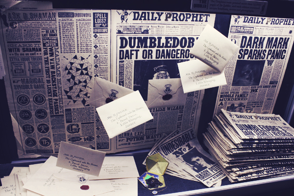
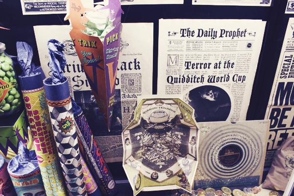
While on the Harry Potter Studio Tour, there was a small little section in the first studio. It wasn't one of the highlights, and it was right before the exit. In a huge glass display they showcased of all the publications created for the films. It was probably my favorite part of the tour. I took heaps of photos and was so excited to see the actual letters and newspapers. They always look amazing on camera, but up close they were gorgeous. The production crew spared no detail and everything was beautiful. Now if I could only create something just as awesome.
 |
| Daily Prophet and Wanted Posters |
 |
| 3D Quibbler |
 |
| The Daily Prophet |
 |
| From Weasleys' Wizard Wheezes |
 |
| From Weasleys' Wizard Wheezes |
 |
| Deathly Hallows Necklace |
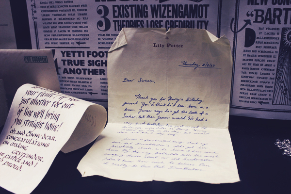 |
| Letter from Lily Potter to Sirius Black |
 |
| Dark Arts textbooks |

